Web Development Essentials for Content Designers: Images
This series offers print designers transitioning from InDesign to HTML an introduction to web development. The fourth post builds upon my previous posts on interactivity, composition, and page reflow to explain how to add images to digital content.
In both print and digital design, imagery is essential. And while the fundamental process of choosing the right image and its relation on the page may stay the same, digital content requires a lot more out of that image. With digital content, an image needs to flex and enlarge according to each device, while also maintaing its original quality. In other words, there is a little more finesse involved to ensure that your image appears how and where you want it, and on every device.
For print-turned-digital designers, understanding the basics of file formats and image integration does wonders for seamless digital content creation. Whether handing off files to front-end developers or coding them yourself, you’ll know what to consider to make the best choices.
Families and Formats
It’s difficult to discuss digital images without talking about the two main image families, vector and raster, and some of their respective formats. There’s plenty of great articles explaining the whys and whens of using each format, so let’s take a look at some details that are important for content design.
Raster
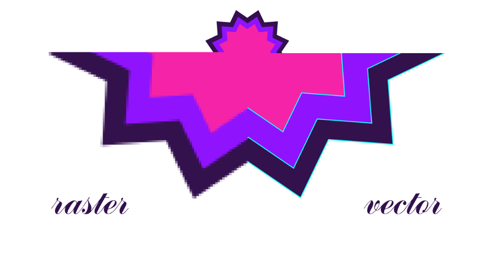
Raster graphics are created by assigning specific colors to each individual pixel of an image. Raster images have a fixed size and will appear “pixelated” when enlarged. This family of formats is great for large images with lots of detail, such as photographs or traditional paintings.
JPG (or JPEG) is the most ubiquitous format on the web due to its ability to compress images, but comes at the cost of a lower-quality image. PNGs are great for smaller images or images that need transparency. GIFs are also great for small images, but are more well-known for their highly-valued animation capability.
Vector
Instead of using individual pixels to store color values, vector images are comprised of math equations that translate into a line or shape and, together, are interpreted into an image. Since there is no pixel-specific information, vector images can be enlarged without becoming pixelated. Vector images are great for solid imagery, such as logos and icons.
Vector formats have become increasingly popular for digital images because of their extensibility with web languages. The most prominent format, SVG, can be manipulated using CSS and other languages to alter the image or add animation and interactivity.
Using Images Effectively
As I mentioned in part two of this series, print design is first rendered (printed) and then sent to the reader exactly as it was printed, whereas digital design is first sent to the reader, and then rendered by their particular devices. That means that it’s important to consider how each image will appear across all devices according to its layout.
If images are closely tied to the content they surround, for example, consider how the content will be affected when the layout adapts to a different screen size. There may even be instances in which the entire image should be replaced with another when viewing the page on a smaller screen.
Images vs. Background Images
Web design languages offer two main ways to add images to a page. The first is a straightforward image tag (<img alt=”” />), placed onto a page as its own object. The image can have its own properties and text will flow around the image if it has been designed to do so.
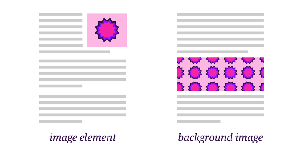
The second approach is to use background images. Instead of existing as an image tag on a page, background images act like textures that can be placed onto other page elements (such as a div or section). Background images offer a different set of properties that control position and size relative to the element they are placed on, and can also repeat indefinitely to be used as patterns.
Text as Images
There are certain unavoidable instances in which text-based content needs to be converted to an image. Some EPUB readers simply can’t handle large text layouts, such as tables and graphs, and those will need to be converted into images. Consider using PNG or SVG (if supported) so that text-based images can have transparent background colors. Additionally, using ems for inline text images (such as math equations when MathML isn’t supported) will ensure the image changes size proportionally to the text around it.
Thinking About Output
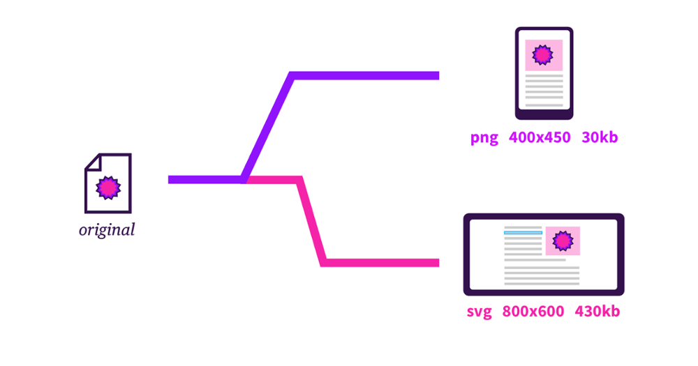
As with any digital content, it’s always important to consider where your content will be consumed to help understand what advantages or limitations may lay ahead. Not all image formats are created equal and some will fair better than others on a wider range of devices. Check the specifications of your intended outputs to make sure you meet the requirements for file format, file size, image dimensions, and others. Consider that larger images will take up more space or take longer to download if your content is consumed online.
The Bottom Line:
Whatever your intended output, images are an excellent way to bring your content to life. But before choosing a file format or placing an image onto a page, think carefully about your image’s purpose and how it should be rendered. With the right pairings, you’ll use the fundamentals of digital images to your advantage.
For more information on how content designers can use Inkling Habitat to create beautiful digital content without a web developer on-hand, request a demo from our sales team.
