How to Add Meaningful Interactivity to Your Digital Content
When looking to liven up digital content, you’ll find an abundance of interactive options, from videos and integrated test questions to dynamic photo exhibits. Each has its own place and purpose in digital content, not least of which is to delight and engage users. A little interactivity can go a long way, and you don’t always need new assets or a lot of technical know-how to create a lasting impression. High-res images, for example, offer simple interactivity through pinch-and-zoom, while chronological lists can quickly become an interactive timeline.
Of course, it’s always important to be thoughtful and intentional about when and where you add interactive elements. Here at Inkling, we encourage our content creators to ask themselves, “Does the interactivity serve to enhance or distract? Does it make the concept more clear, or less?” By defining a clear purpose for each interactive element, it’s less likely that it will become just another accessory.
For more in-depth guidelines, we’ve compiled four interactivity standards to help gauge when you should, and just as importantly, when you shouldn’t, add interactivity to your content.
1. Use interactivity to engage multiple learning styles and to reinforce key lessons
Where simple text falls short, audio or video components can bring a concept to life. Take language learning, for example; being able to, at the click of a button, hear native speakers engaging in dialogue helps your users learn correct pronunciation. Or, for employees that must operate expensive, dangerous machinery, having a training video on-hand instead of just a series of diagrams can make the difference in safety and accuracy.
To learn more about creating interactive content that will work beautifully on multiple devices, read our 5 must-ask questions before starting a content project.
In other cases, it’s important for users to test themselves on the material with self-study tools, such as flashcards and intermittent test questions. For employees studying an operations manual, test questions help ensure that they can correctly identify all parts of a machine. Or, with the ability to leave notes directly in the digital manual, employees can keep a journal of their questions or aha moments right in context.

2. Remember to use all types of interactivity
Interactive elements don’t have to be flashy to be effective. Simple, inherently digital forms of interactivity change the user experience more than you might realize. Adding links, pulling supplemental material directly into your digital content (instead of sending users off to an external website or asking them to insert a CD-ROM), and providing instant definitions for glossary terms and key words are all simple, effective ways to help users better understand your content. If users don’t have to expend a lot of mental energy making sense of the organizational schema, they can put all of that mental energy toward absorbing the actual content.
3. Use hide-and-show interactivity to prevent text overload
Incorporating slideshows, test questions and poptip annotations within your content allows users to uncover hidden information bit by bit, without feeling overwhelmed by the text all at once. This can be great for breaking down complex concepts and detailed graphics.
 Poptip annotations
Make sure that you match an interactive element that includes hidden text to the correct learning content, however. Slideshows, for example, tell a story; they are a carousel of related images meant to be viewed in sequence. They don’t fare well for images meant to be compared and contrasted. Similarly, placing text in poptip annotations allows users to reveal extra details and targeted information, but poptips shouldn’t contain primary content. Finally, keep track of how many clicks it takes to get to your content–too much friction can leave your users feeling frustrated trying to find the information that they need.
4. Don’t add interactivity for interactivity’s sake
While interactivity offers users an exciting way to engage with your content and better internalize its core messages, it’s all too easy to overdo it. There’s a fine line between enhancing your content and inadvertently diminishing its teaching power. As a digital content developer, you need to be ever mindful of the end-users’ cognitive load–too much going on in the content will make it hard for users to successfully take in any of it.
Likewise, though it is valuable and recommended to take advantage of multiple interactive elements, you need to be careful that those elements reinforce, and don’t conflict with, one another. For example, an added audio narrative that corresponds with your text can help users absorb that information more deeply. However, if your audio narrative says one thing, while users are also trying to read text that says something else, users will experience interference, making it difficult for them to access, and certainly retain, the core message.

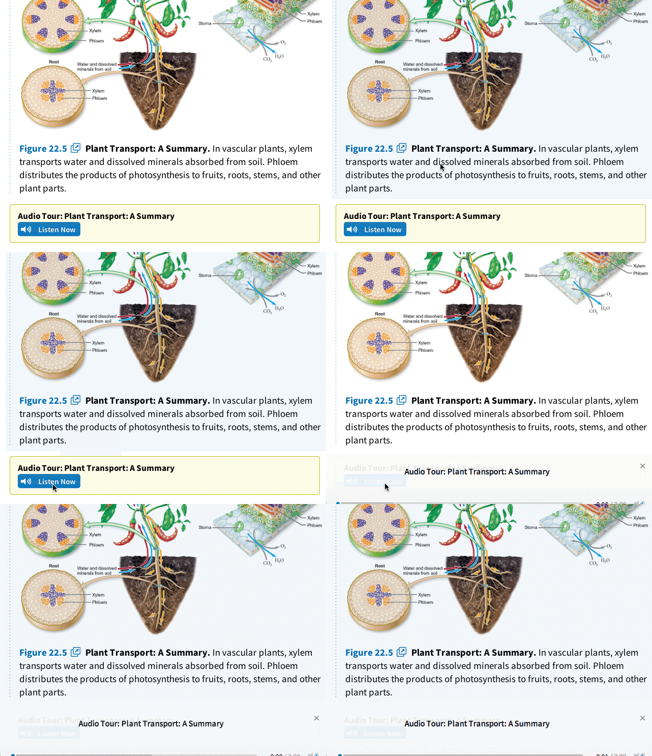
Audio tour
The bottom line:
It’s an exciting time to be a content developer, with new opportunities and capabilities emerging every day. However, as you work to bring your digital content to life, stay mindful not only of the sheer volume of interactivity being added, but also of its core function. A little editorial expertise and the right amount of meaningful interactivity will go a long way in creating digital content that both engages and delights your users.
Training a millennial workforce? Learn more about how to captivate your millennial employees with rich, interactive content available anywhere.
